Baker Coffee
Mobile ordering app for consumers who enjoy breakfast foods
Role Duration Tools
Sole Designer 3 months Figma
The Baker Coffee application aims to enhance a mobile ordering system for customers who want to enjoys these products, but lack the time to appear in person due to busy schedules.
Problem statement
Consumers are often too busy in the morning to order and pick-up food and coffee in stores due to their busy work or school schedules.
Design goal
Design a mobile ordering application for Baker Coffee that allow users to easily complete user tasks efficiently.
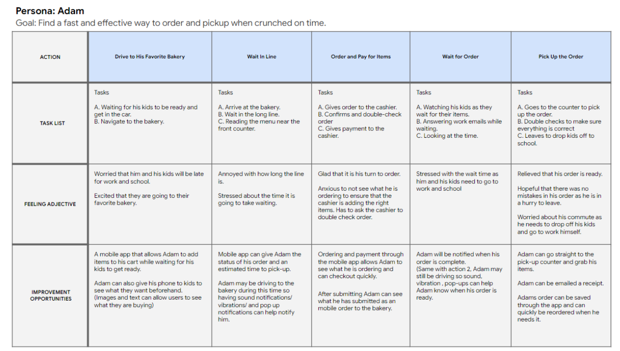
1. Understanding the user
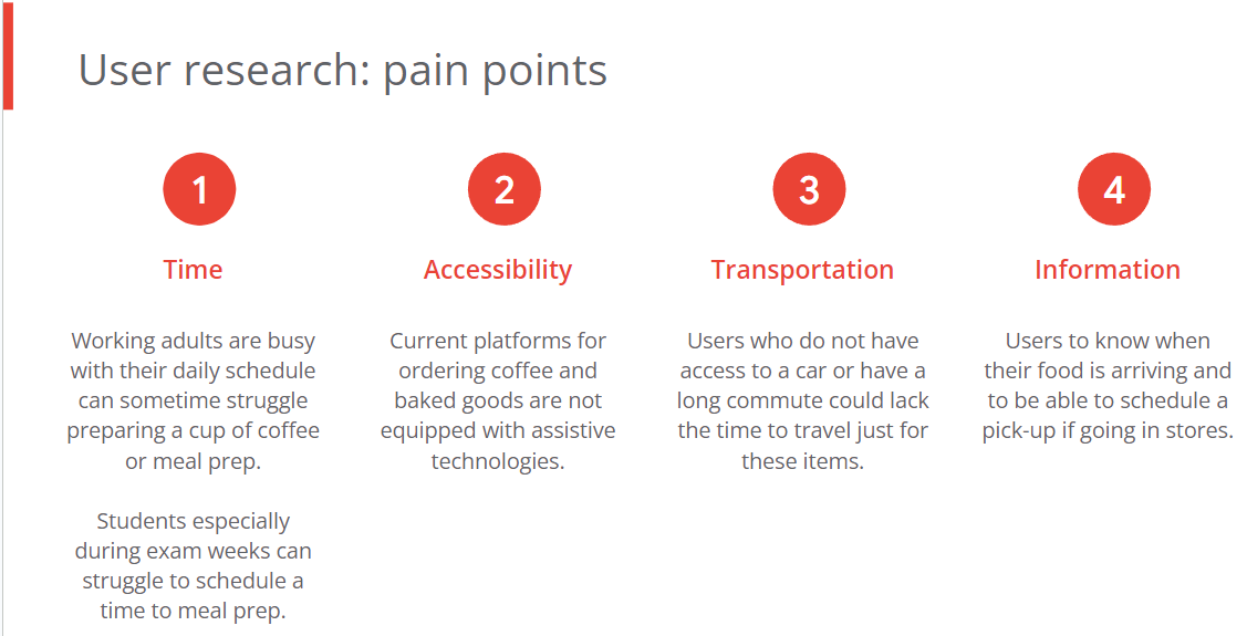
Research insights:
Based off the findings through user interviews and surveys, our two primary user groups we identified were working adults and students who would not have time in the morning due to busy schedules.
2. Starting the design
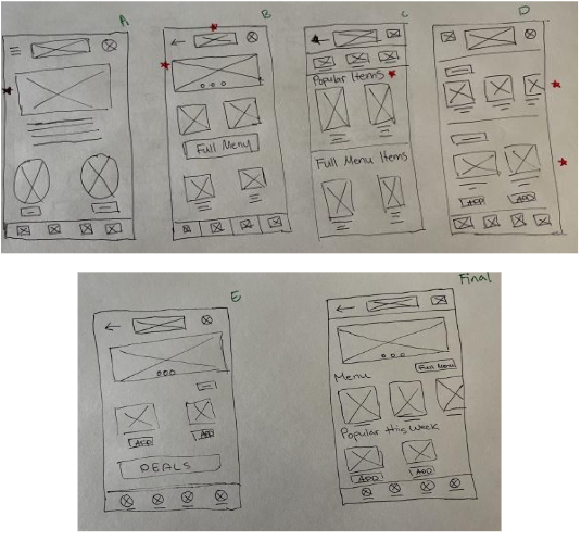
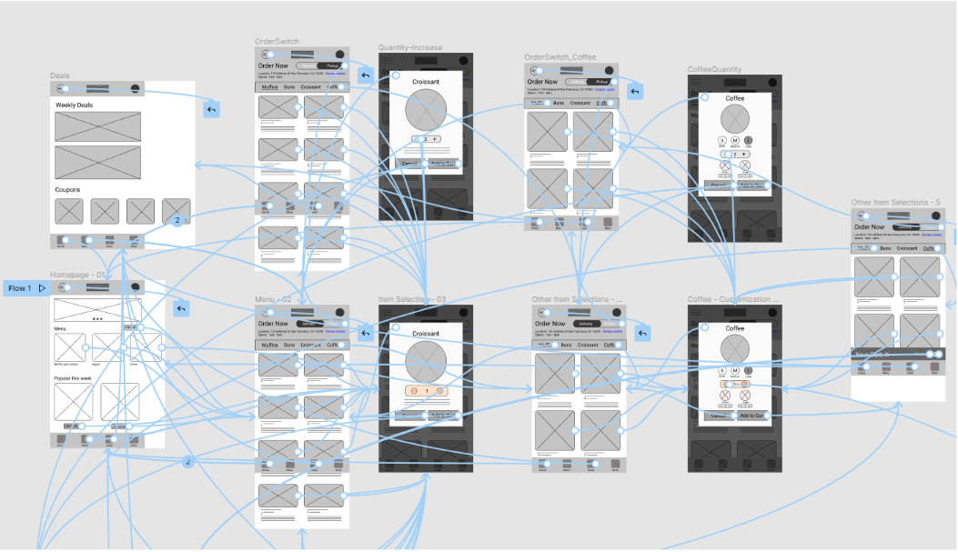
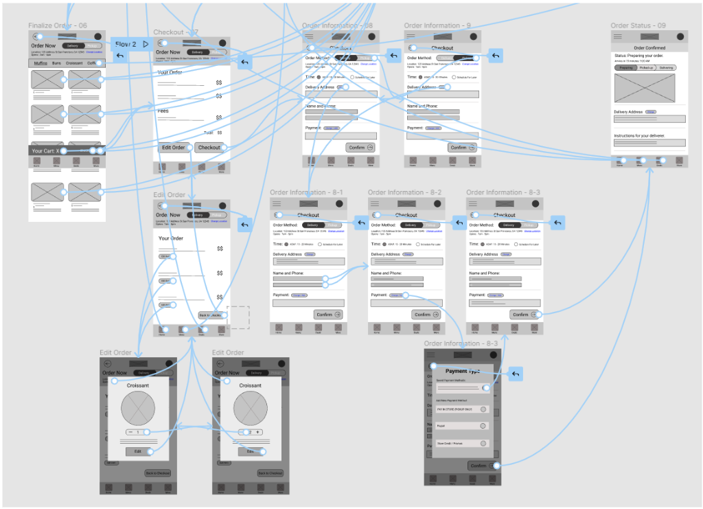
In the initial design process, I designed the main screens for our first user flow iteration. This was done through paper wireframes that were later transitioned to digitality through Figma.
Paper Prototypes
Digital Wireframes
Low-fi Prototype
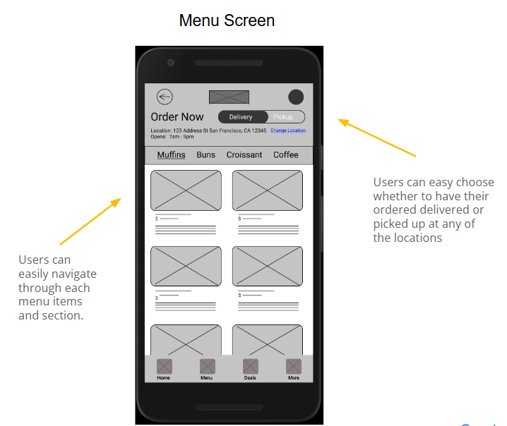
Task 1: Navigation and interaction with food items
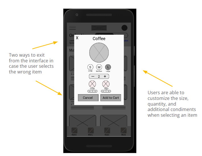
Task 2: User payment and Checkout
User Testing
Usability testing was conducted with two user groups. In group 1, users were allowed to freely navigate through the application interacting with as many elements on the screen. Group 2 were given the two user tasks to perform.
Group 1 findings
- Users enjoyed how easy it was to navigate between interfaces.
- Some users were confused when editing items from their cart. (e.g unsure if it was saved or changed)
- Some elements in the home screen are repetitive and felt cluttered.
Group 2 findings
- Users liked the linear flow of adding items into their cart and checking out.
- The customization interface for food items were helpful for the users.
- The menu navigation bar allowed users to easily navigate to items in their buy list.
3. Refining the design
Mockups
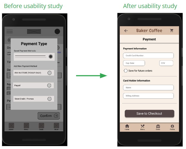
The main goal during the early design process was to ensure that users can easily enter their checkout information.
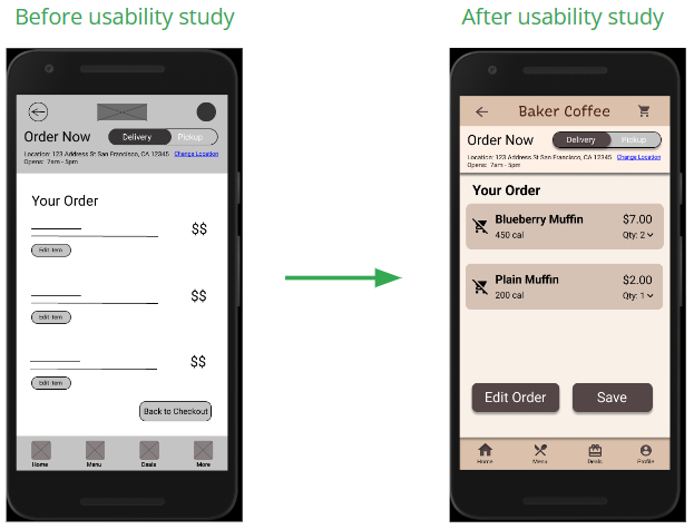
After usability studies, users a majority of users asked if there was a way to save their information for future purchases to speed up the checkout process.
During usability testing, users were tasked to adjust the food quantity in their cart. Although a majority of users completed the user task, 80% of users were unsure if their items were saved or changed.
Icons and a save button were added to ensure users can visually see their updated items.
Key mockups
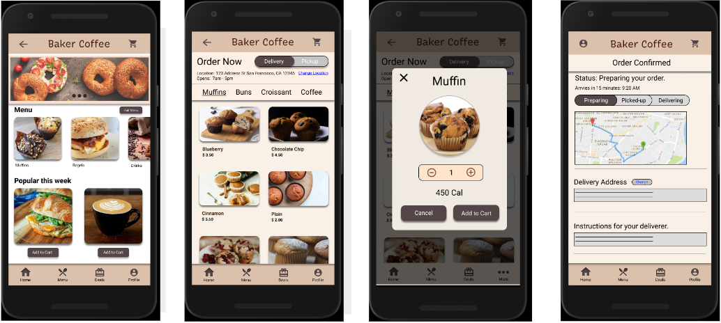
High-fi Prototype
The high-fidelity prototype presents a more cleaner user flow for adding and customizing items to carts. Checkout and payment have also been iterated for a more efficient and cleaner user flow.
Hi-fi Prototype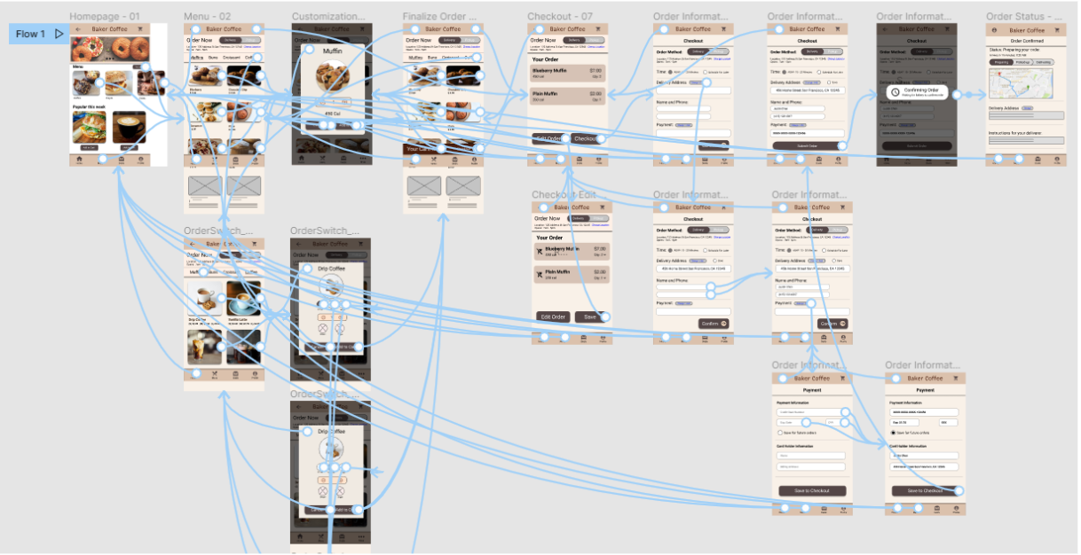
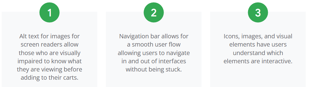
Accessibility consideration
During the visual design process, I considered the accessibility paint points for users who may need guidance while accessing and performing user tasks.
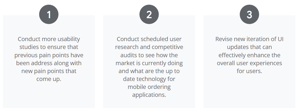
4. Going forward and next steps
Impact
- Baker Coffee makes users feel the importance of quality service of food items while addressing their everyday morning needs.
- This application ensures that users can still have a productive day while enjoying items offered through this mobile application.
What I learned:
- Usability studies and feedback is extremely important for iterating and conducting a jump start for the next steps during your design process.
- Data and findings obtained from the beginning of your user research play a major role in how you form ideas during your initial design process.
Next steps:
Let's Connect! 👇
© Johnny Luo 2026 All rights reserved