BSOE Redesign
2020 | Winter Quarter Team Design Challenge | UX Design | University of California, Santa Cruz
Problem Space
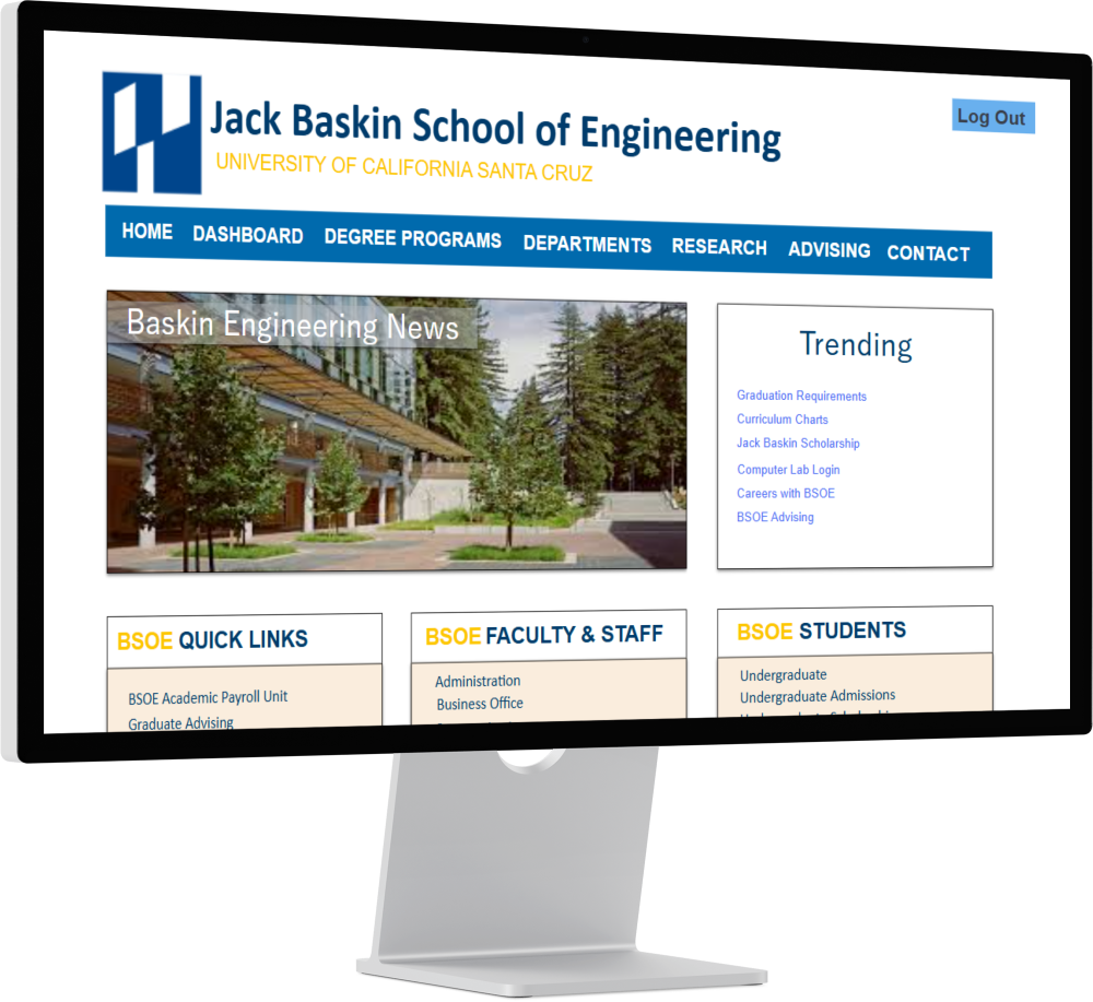
The biggest issues we identified with the current BSOE website is the inconsistency and confusion with users.
- Inconsistent - The website design changes dramatically from each class major department and the information isn't up to date for students to use.
- Confusing - The current target user for the website is unclear. News and Alumni features take up 80% of the visual space making it hard for students to find information they need.
Goals and Redesign
We believe that the website can be adapted to focus from on undergraduate students as our target users without losing too much of its current design.
- Our main feature we look to implement is the use of a student login page connected with their university email.
- Allows users outside our target user group looking for BSOE information regarding events and news, while undergraduate students can receive personalized results with the information they need.
Phase 1: User Research and Empathy
Our team interviewed 16 BSOE affiliated students with experience using the previous BSOE undergrad website.
Extreme to high severity issues our users face
- Degree Programs Mismatch (Extreme 🔴)
- Broken/Dead Links (High 🟠)
- Important Links Not prominent (High 🟠)
What our users would like to experience.
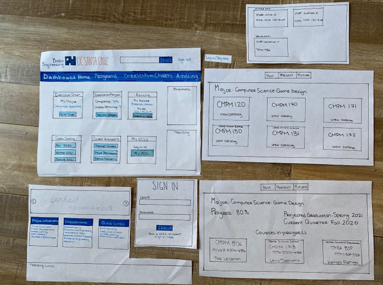
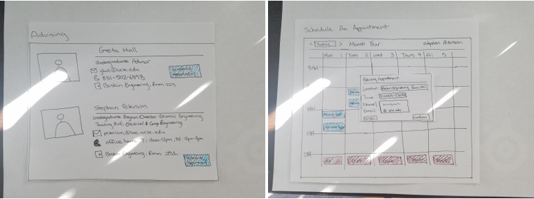
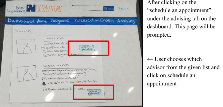
- Make curriculum charts, class schedules, and advising info easy to access.
- Enable CruzID login for personalized results.
- Improve navigation so students quickly access information.
Ideation
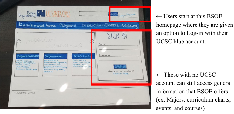
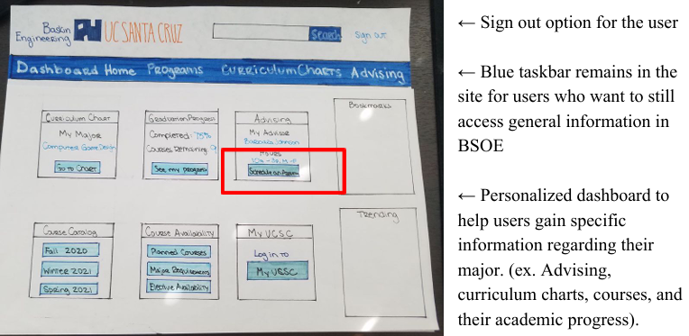
Based off user research, we brained stormed ideas to help resolve the high severity issues that were then implemented into low-fi paper prototypes.
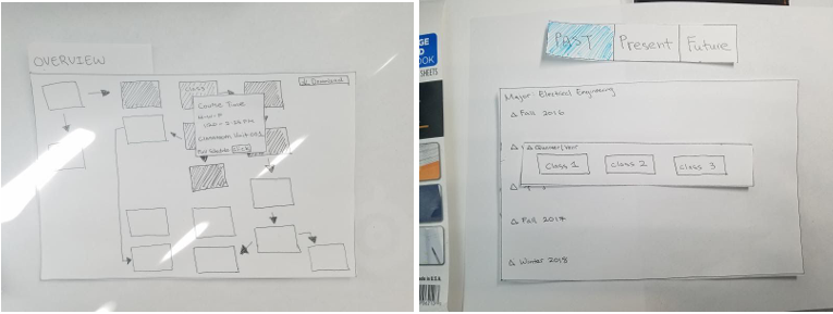
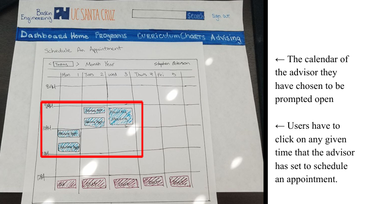
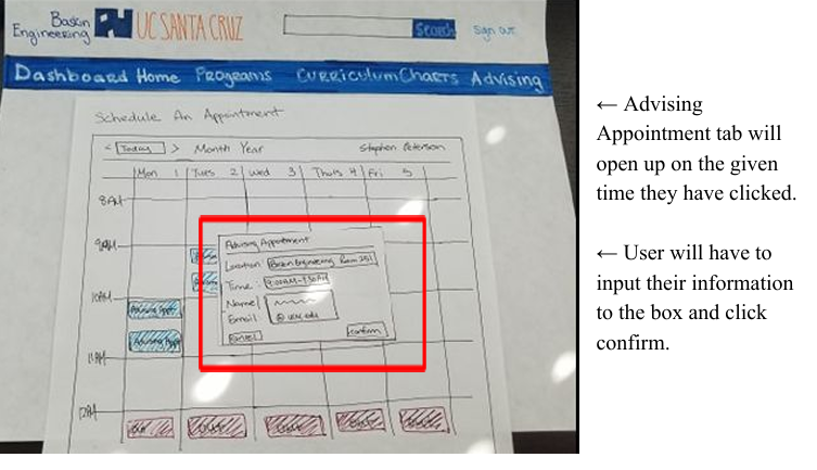
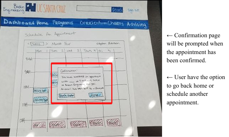
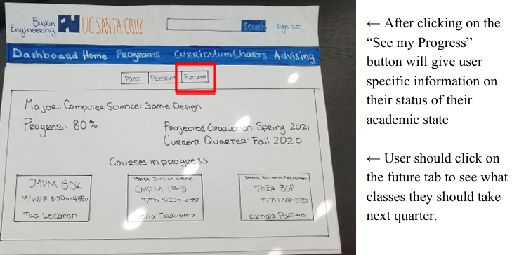
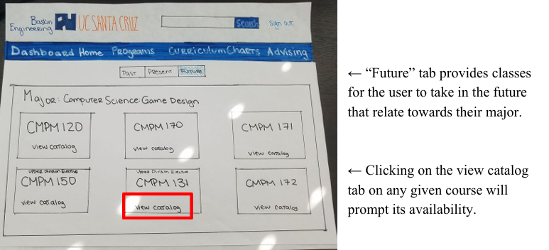
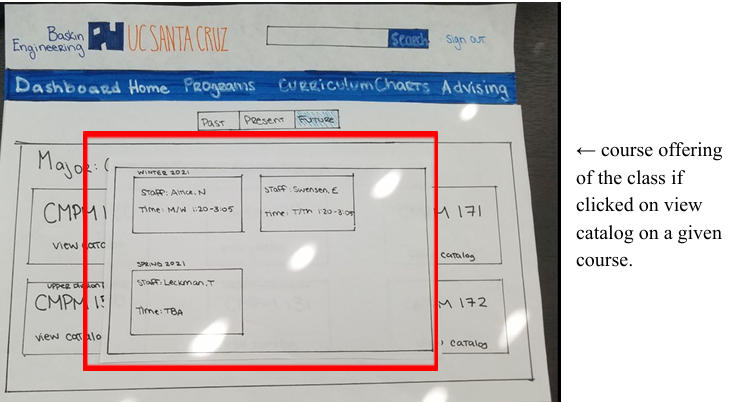
User Flow with UI Elements
Flow 1:
Login.
User Testing
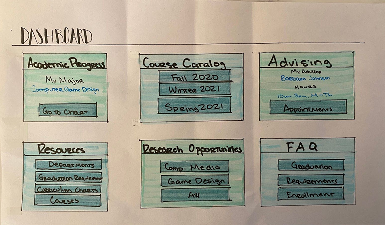
We conducted usability testing for our prototyping by having users performing three tasks while navigating the website. During testing, we took count on the amount of times the users has to click back or undo actions when performing tasks. After testing, participants were asked to fill out a 12 questionnaire PSSQ form alongside an interview consist of open-ended questions.
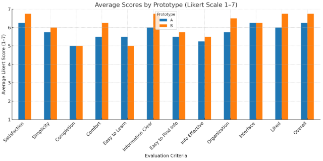
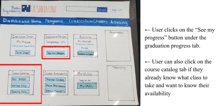
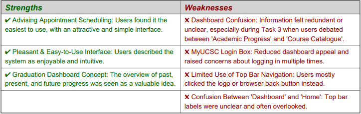
From our paper prototype feedback, users had recurring confusions with our main dashboard page. We focused on redesigning this page and created two version that were used for testing prototype A (old) and prototype B (new). For prototype B we reduced the amount of option boxes the users can choose from to reduce redundancy. Enhanced visual components were added allowing users to have a more direct understanding on interactive elements.
Takeaways and Reflection
This was my first team project, where I learned key skills in user research and testing. Our redesign focused on understanding users, and research revealed many inconsistencies and incorrect information on the previous BSOE website. Collaborating with my team provided valuable insights, especially when improving the user dashboard. With more time, I would have conducted additional user testing on the digital prototype to better understand the user flow. Overall, I’m proud of our team’s work and the research skills I developed as a designer.
Let's Connect! 👇
© Johnny Luo 2026 All rights reserved